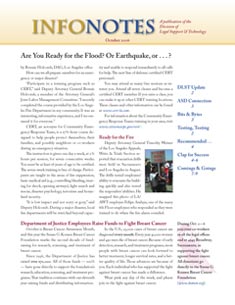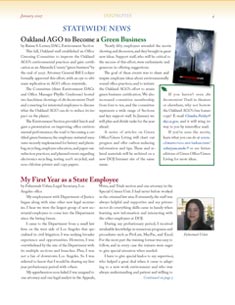
Last year I got a call from a prospective client regarding a newsletter project. The client, a state agency with six offices throughout California, wanted to consolidate the individual newsletters created at each site into a single newsletter.
First step was a redesign while they searched for an editor. None of the offices had a dedicated editor; the job was assigned to individuals who shoehorned the newsletter work in between their regular duties, and the newsletters of the six offices lacked an overall agency design.
I got the design job. Details: A monthly newsletter of 6-10 pages in PDF, distributed through the intranet. The design was to be professional and friendly; the purpose was to share technical tips, need-to-know news, and job announcements; and to promote morale by recognizing employees, sharing promotion news, and highlighting the agency’s accomplishments. The newsletter should coordinate somewhat with the Department of Justice website. Newsletter readers were attorneys and support staff including secretaries and legal assistants, and analysts, managers, technical staff, and other staff.
Three mockups
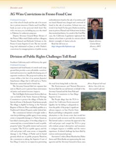
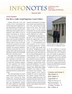
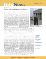
I provided three initial designs based on a palette of red, blue, and gold pulled from the website. Although the distribution method — on screen — permits full color, working with a few main colors gives a more cohesive look. Photos, of course, were used in full color.
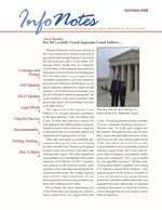
The final design
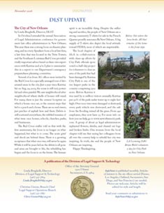
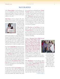
The client liked design #1 the best, and over the next six issues, while the process of hiring an editor continued, the design was refined. Green was added to the palette to highlight the new environmental column. The gold logo in the masthead was provided by a DOJ employee (see the second image). Some regular column names changed, and some columns were added. Folks from all six offices were recruited to send in articles and photos.
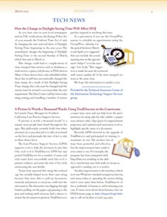
Feedback from readers was positive. People complimented the professional look and liked being able to pick out names with a quick scan (see the Accolades page, last image).
